


Tigger word: 3l3ganc3
ZIT Weights : 0.8 -1.2
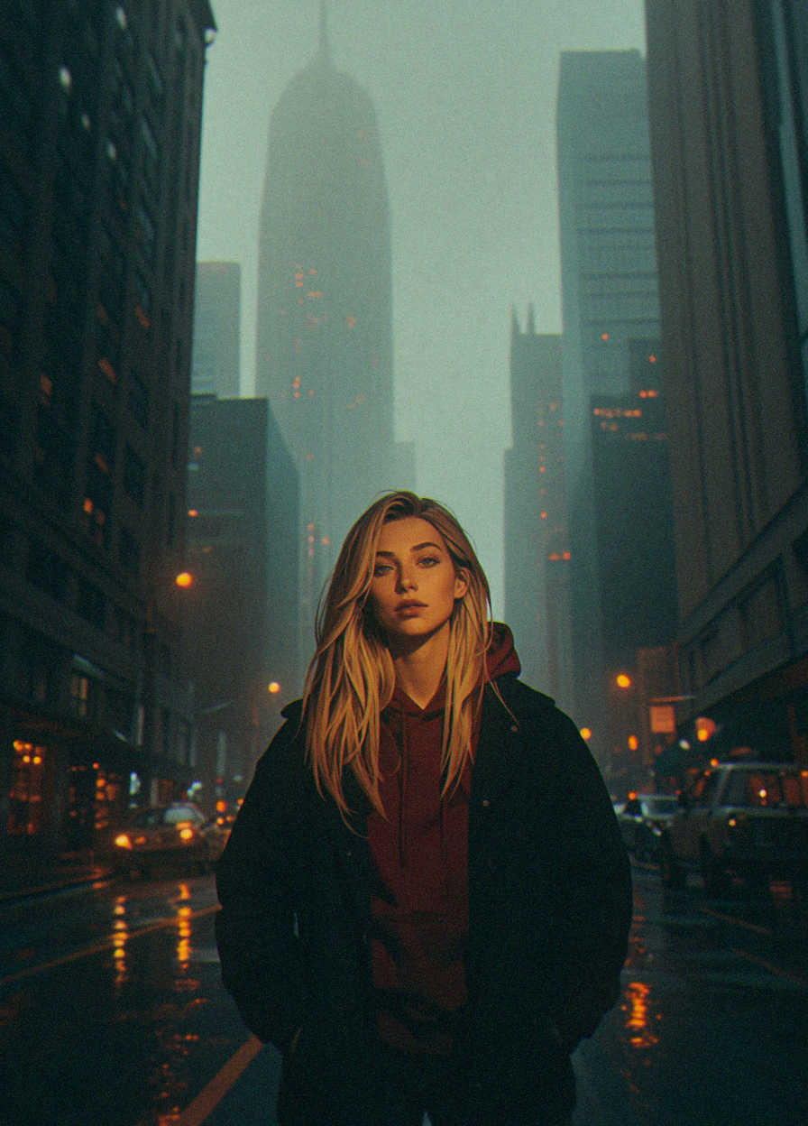
So added the ZIT version, I am very happy with the results even with training on a much smaller data set, there as still a few issues and my prompting style is a mess (sorry i am new to natrual language prompting) one of the things i am trying to fix in possible future versions is reducing the very warm coloring this lora defaults to (you can brute force it with prompts if you want).
Please feel free to share your feedback, I am still trying to refine it :)
------------------------------------------------------------------------------------------------
Illustrious Weights : 1 -1.6
This is lora was designed to replicate some the niji 6 realistic anime/draw art style, the data set mostly focused on portraits for male and female but you can brute force it for more dramatic poses.
Some of the features can be triggers using prompts like "3l3ganc3, realistic, semi-realistic" etc..
I have tried it with several illustrious/SDXL/Pony models and it seem to works well flat anime style as well as more 3d styles (though it intended more for the former, I shall update more resources that work with it as I discover them myself).
Description
ZIT version of Elegance- this is trained on a slightly high quality data set then the original, but the overall look should remain similar but better :D
FAQ
Comments (12)
Awesome ZiT lora - love the style!
Thank you so much, i am glad you are liking it :D
I have very often looked at your image to ideas and making my prompts look non weird (I mostly fail) :D
@purplelady Hah, my prompts are a mess most of the time. Wildcards can get really sloppy :|
@prompt_bit_sorcerer i never use them, my computer is really old so using wildcard mean to many random results i don't know what to do with usually one generation takes 5mins for me long enough to slap together the next prompt :D
just wanted to point out, you named the file elegence, instead of elegance or 3l3gance :)
oh yeah, i know ill fix it at some point when i upload a new version :D I suck at spellings so that is probably why :D
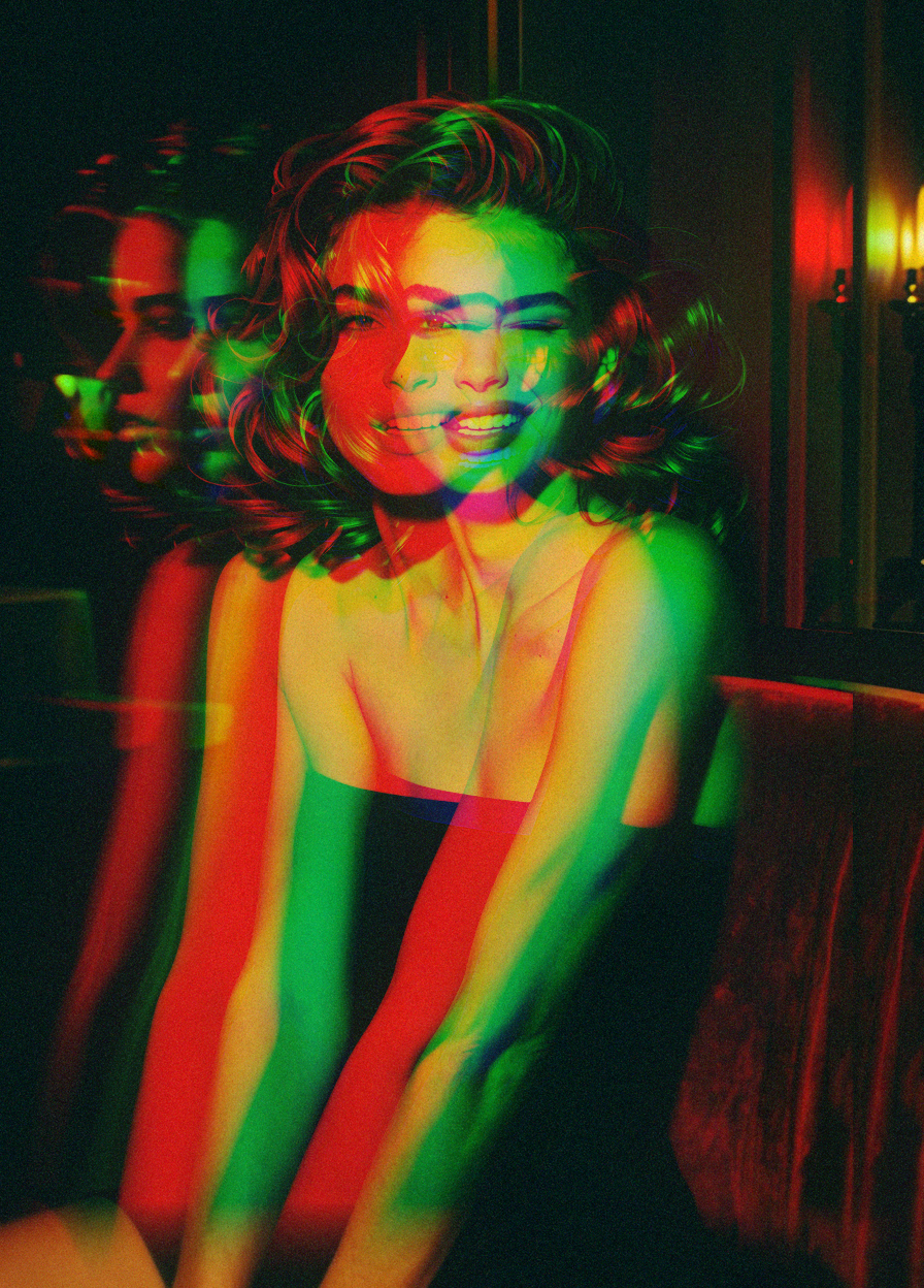
I've been trying to recreate the grainy look that a lot of your sample images have, and I have even matched your workflow and still do not get the same results. Are you doing anything special to get the film grain?
oh yeah i use this to add the film grain :)
https://github.com/digitaljohn/comfyui-propost
i do the post processing as a separate pass so i can't preserve the metadata for it otherwise it overwrites the generation data. let me know if you want the settings i usually use
@purplelady Ah that explains it! Lol! Thanks for your reply! If you wouldn't mind sharing your settings that would be great!
@cubby_ai i use fine grain, with 0.5 for the shadows and 0.45 for the strength most of the time, these work out most of the time for darker images, i usually reduce them to 0.35 when the background is very bright because otherwise it really stands out.
next time i have it open ill send you a screen cap of the exact settings
@purplelady Thank you so much! I really adore your LoRAs, and appreciate this extra work!
@cubby_ai thank you i really like your models too :D
ok correction here are the settings:
grain type: fine:
saturation: 0.6
power:0.4
shadow:0.5
everything else is the default 1
i also keep the seed fixed otherwise it generates a new random noise each time you run it, which on my old gpu just added a step if you computer is newer you can keep it at random like the default