
Hey guys and gals!
No EA this time, BUT 👇
I encourage you to post at least one image after downloading my model.
Just 150+ postings will compensate training costs at CivitAI. You can also collect this model or interact with my images. This is just a TIME for you but IS A GOLD to me.
BLUE BUZZ is the only thing required to make new trained model ;)
I don't ask you to donate YELLOW BUZZ, but will be very glad if you spare some. No matter what, all my BUZZ will be spent inside CivitAI on training new models.
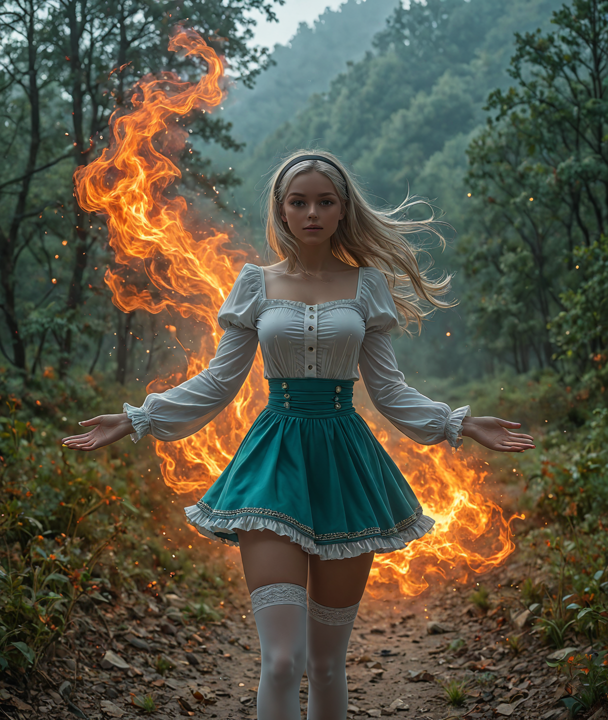
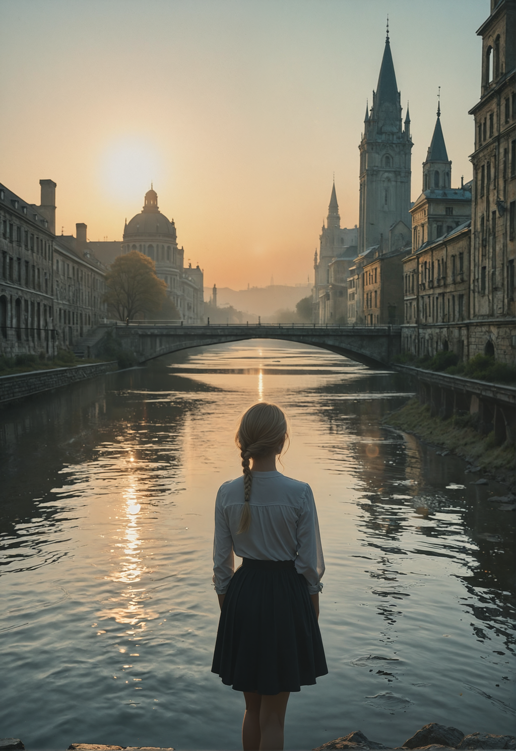
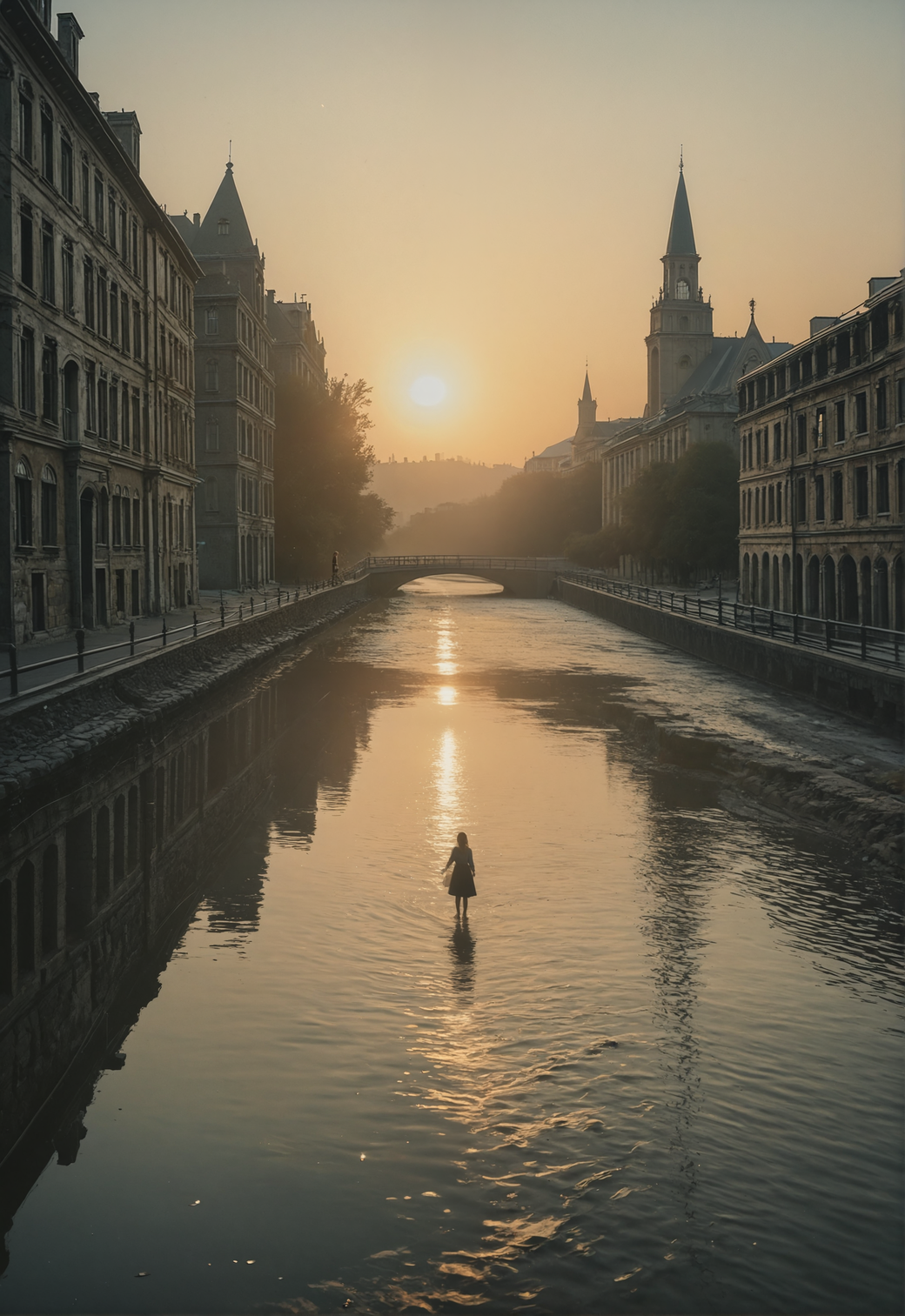
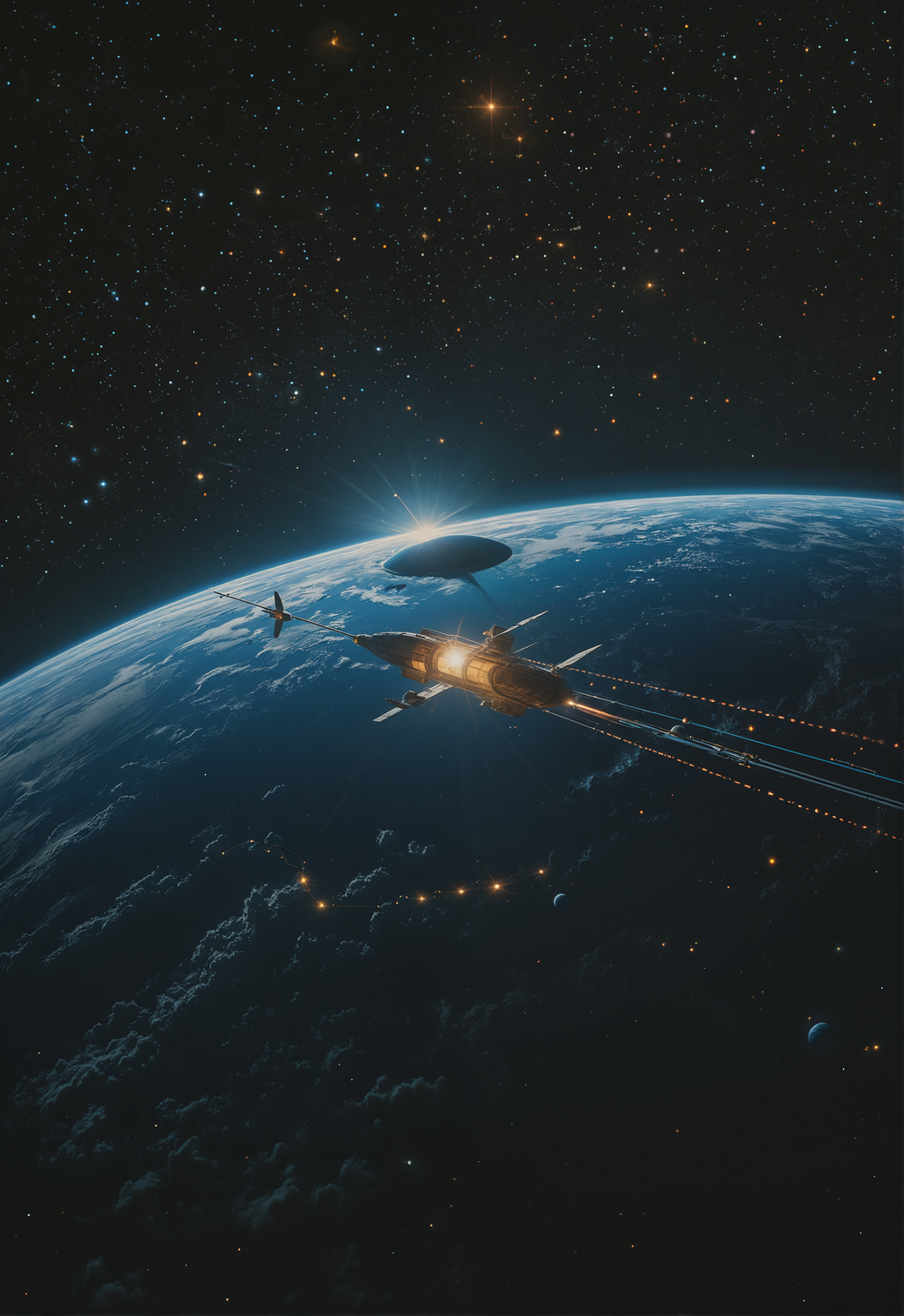
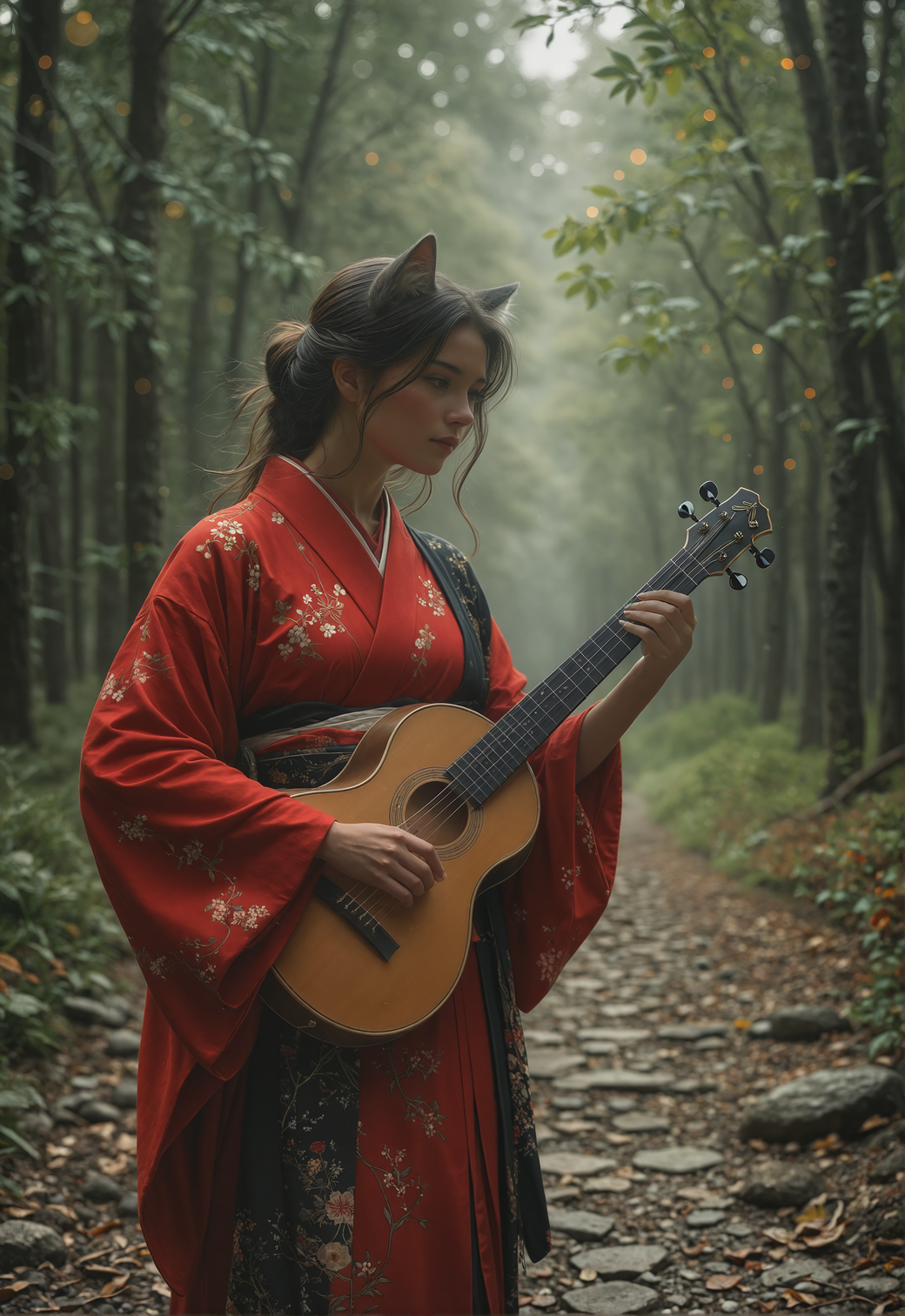
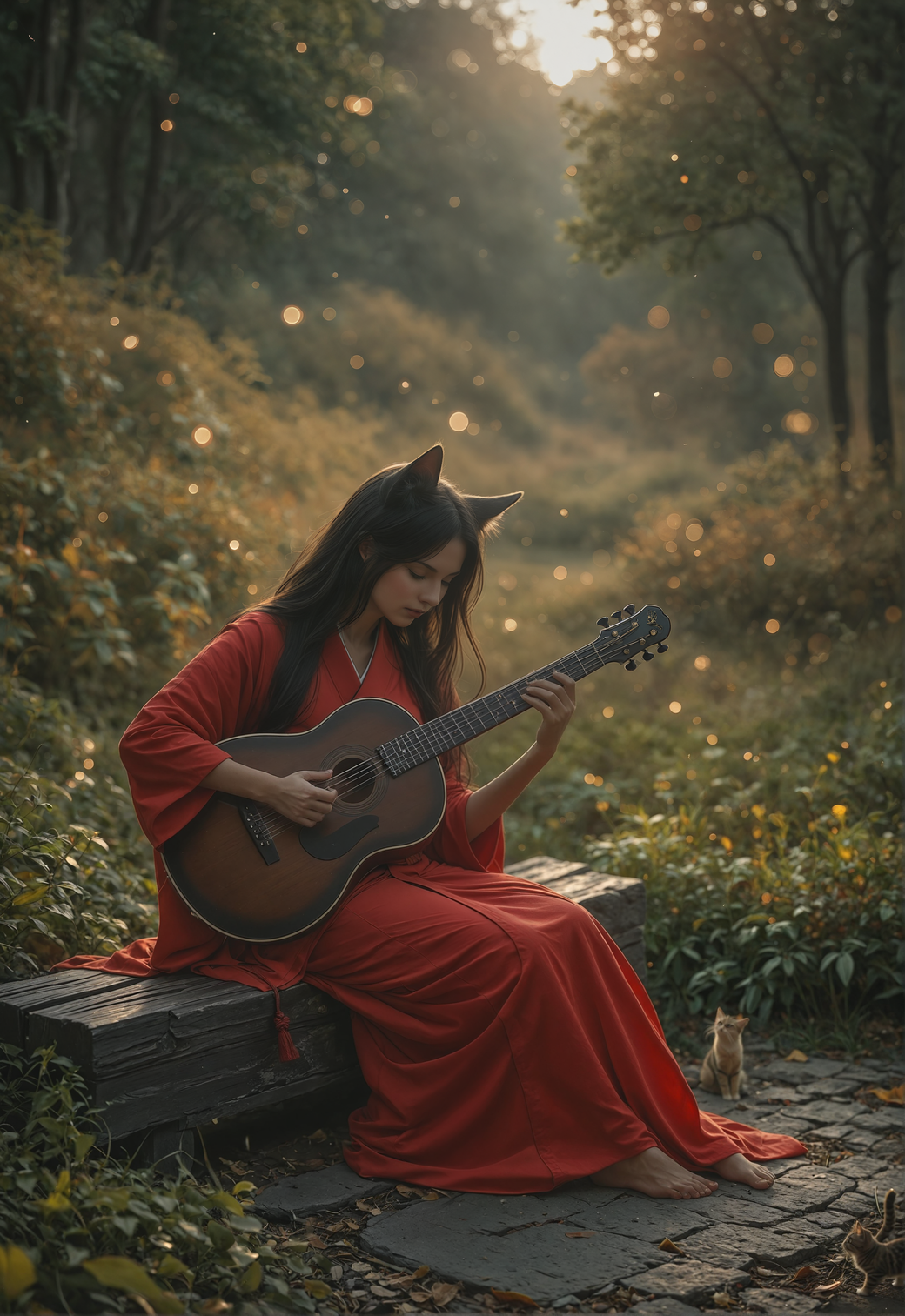
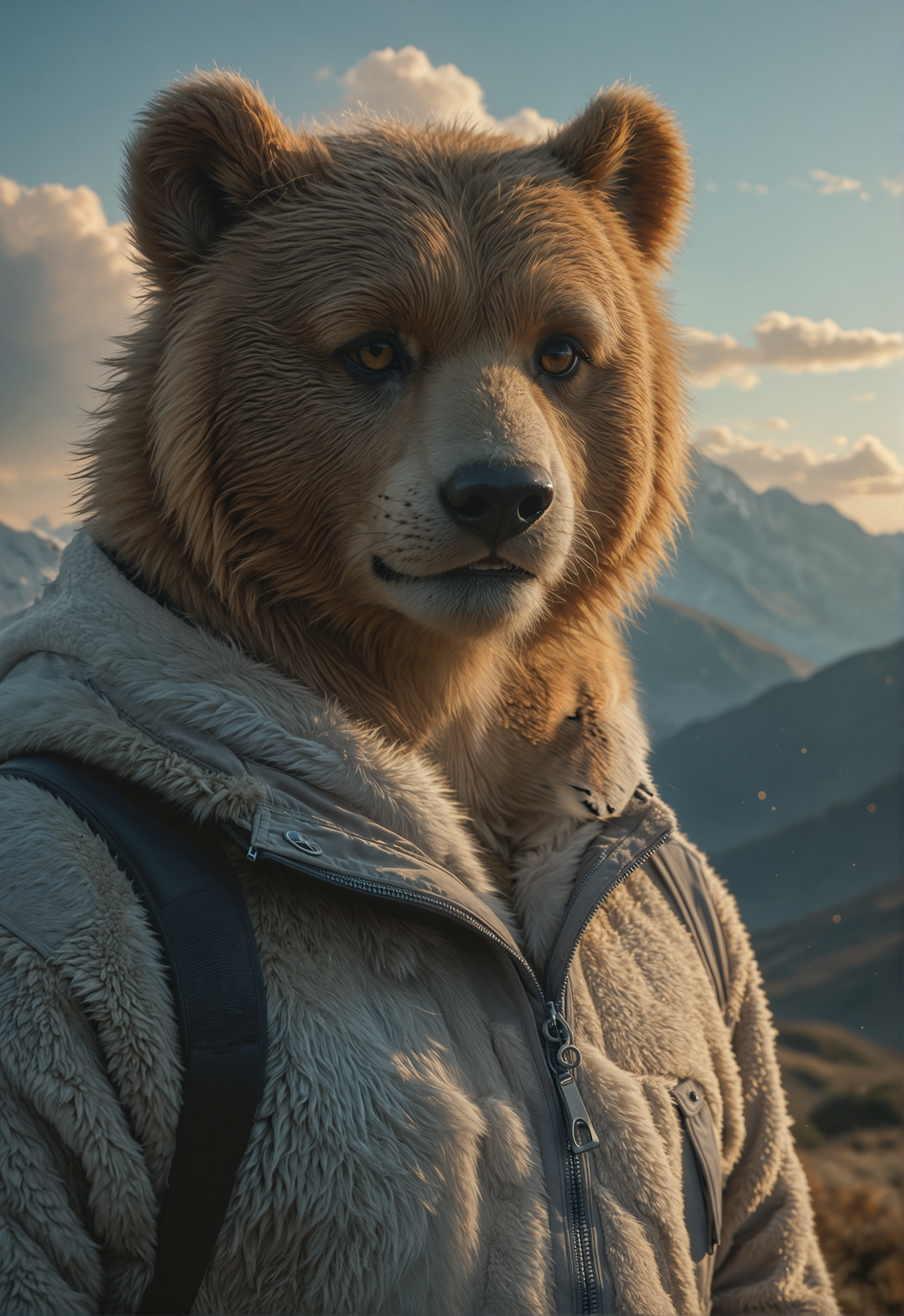
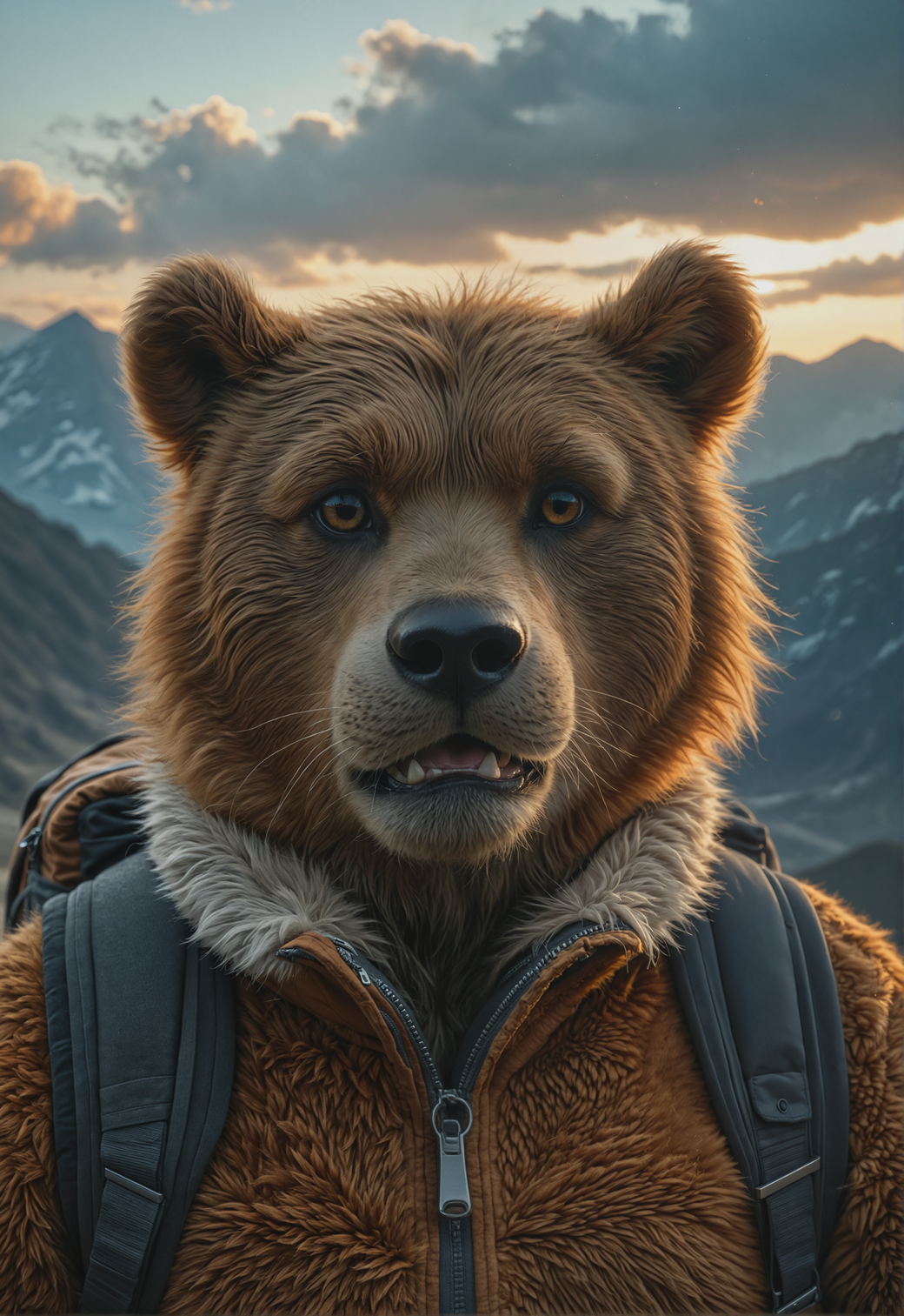
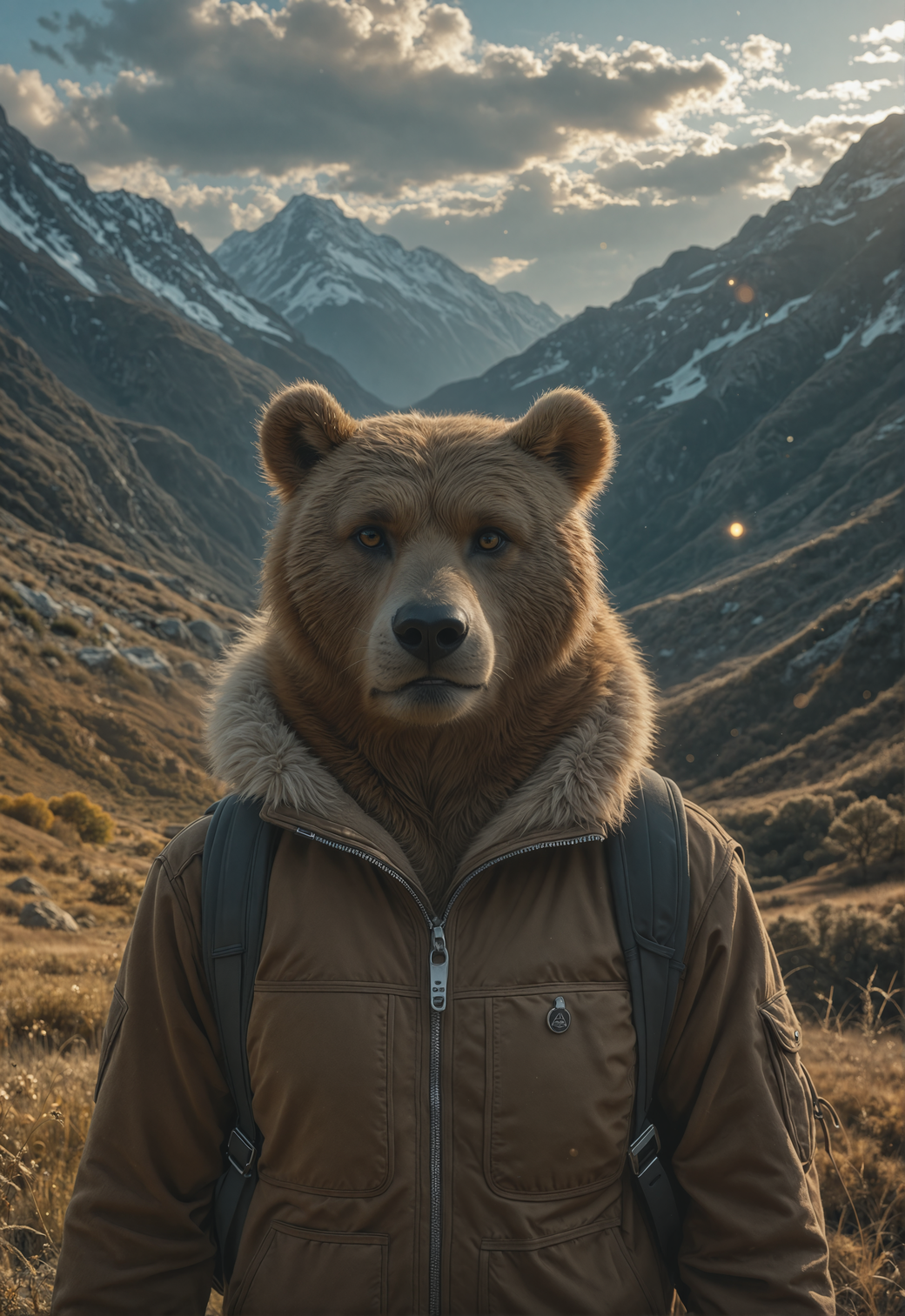
TL;DR; Combination of creative visuals and sharpness of CinPony v2 with Booru / Natural language prompt adherence from Illustrious models. Feel free to post flawy examples and comparisons. I'm open for critics as usual.
[DISCLOSURE] I am using the Post-Maker (3-pass workflow) to produce HQ images using only the released model. You can download it and modify the Steps or resolutions. Steps 30 for 1st pass and 8-10 steps for 2nd and 3rd passes are enough to produce good results 90% of tries. 3rd pass is not so important.
V2 Highlights
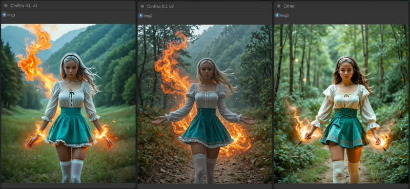
RE-balnced colors toward true color natural palette
Sharper render - more small details
More natural expressions, poses and environment textures / geometry
Better lighting
Wider CFG range (CFG 7 == realism)
V1 Highlights
<TBD>
Description
RE-balanced colors toward true color natural palette
Sharper render - more small details
More natural expressions, poses and environment textures / geometry
Better lighting
Wider CFG range (CFG 7 == realism)
FAQ
Comments (13)
Amazing model thanks for sharing, For some reason I am having to adjust the exposure, brightness, warmth on most images not sure why.
Possibly CFG is too high. V1 loves CFG 3-5. V2 can work well at CFG 7.
@homoludens That would make sense I do use high CFG
nice
While I'm getting mostly structurally consistent generations with v2, the exposure/contrast/saturation are way off on all of them. All images look like they have their dynamic range aggressively compressed with some sort of HDR treatment. This phenomenon is unique to this checkpoint, and cannot be explained by the CFG/sampler/scheduler combination.
I'll look into it. Probably brightness raised too much during adjustment phase. Thanks for feedback.
We can call this a style. Toned down contrast with toned down HDR and slight more brightness. Its not realistic, but stylish.
@sanjithkanin589 I'm still not satisfied. this HDR style is much less of an issue than previous problems with adherence and stuff, but I want to fix that.
Can you try some of my Cinematic LUTs model with low weight like 0.15..0.25 to see if exposure gets better for you?
I plan to merge them in MBW mode to phase down the dynamic range. without damaging the sharpness and composition
@civit77899 I've released the V3. Could you check if it works better for you? Would be nice to get yet another feedback and samples.
@homoludens I uploaded a bunch of images. It's definitely much better, yet unusual; to the point we can really call it a style. On some images I had to crank CFG to extremely high values (CFG=7 for Euler Dy CFG++ is a lot), but some required moderate value or burned. I still haven't decided on the quality prompt; I uploaded two images with a castle in background, with and without one.
@civit77899 LOL... don't remember what I wrote... Just mentioned new version probably. funny
@homoludens ???
@civit77899 am tired... didn't read before Ctrl+Enter...