


If you like my work, drop a 5 review and hit the heart icon. it's free and keeps me motivated
All my models are officially hosted and maintained by me on Tensor.art . use my Exclusive and public model for free on tensor.art
06/06/25 : v2.0p released
Main focus of 2.0b is cleaning the style influence of v1.5
19/02/2025 : On-site Generation added
Private commission on fiverr
Get early access to my upcoming NSFW Lora on my Patreon.
early lora share on discord for patreon.
I was hoping you could support my work by joining any one of them and get early access to all my upcoming loras and other perks, such as fan requests and a Discord role.
Join my Discord Server
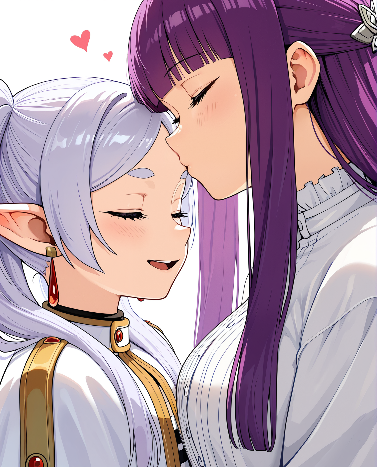
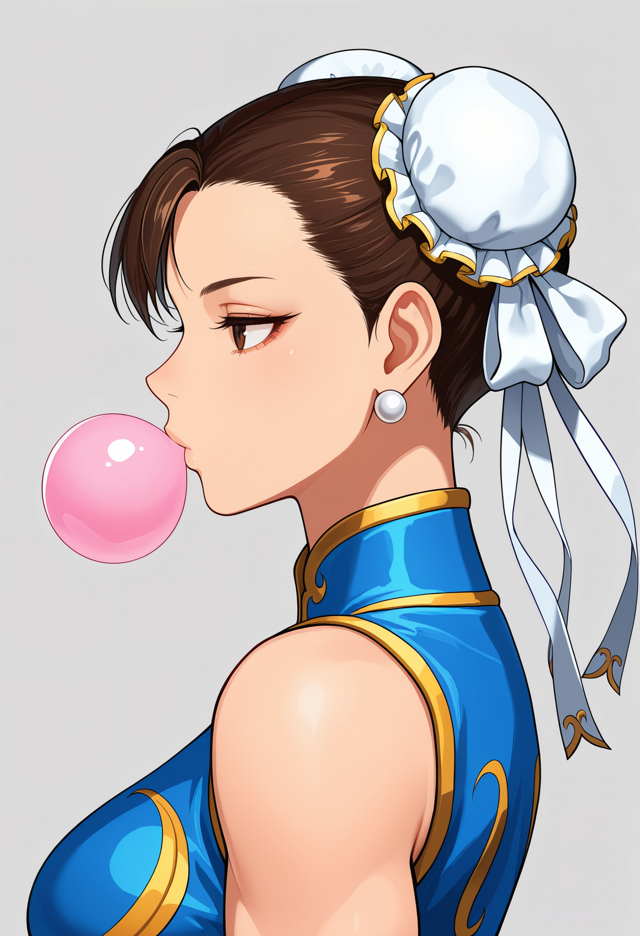
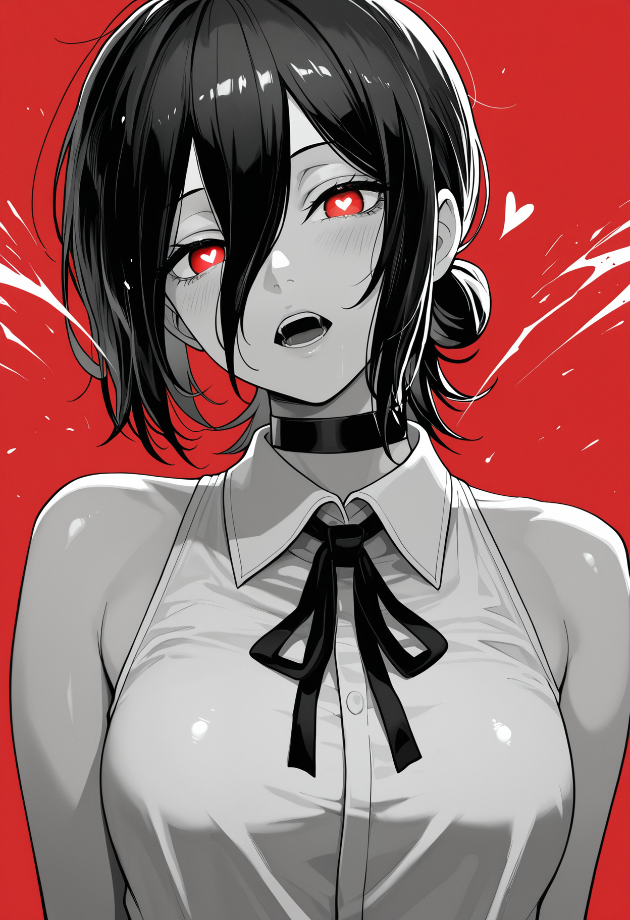
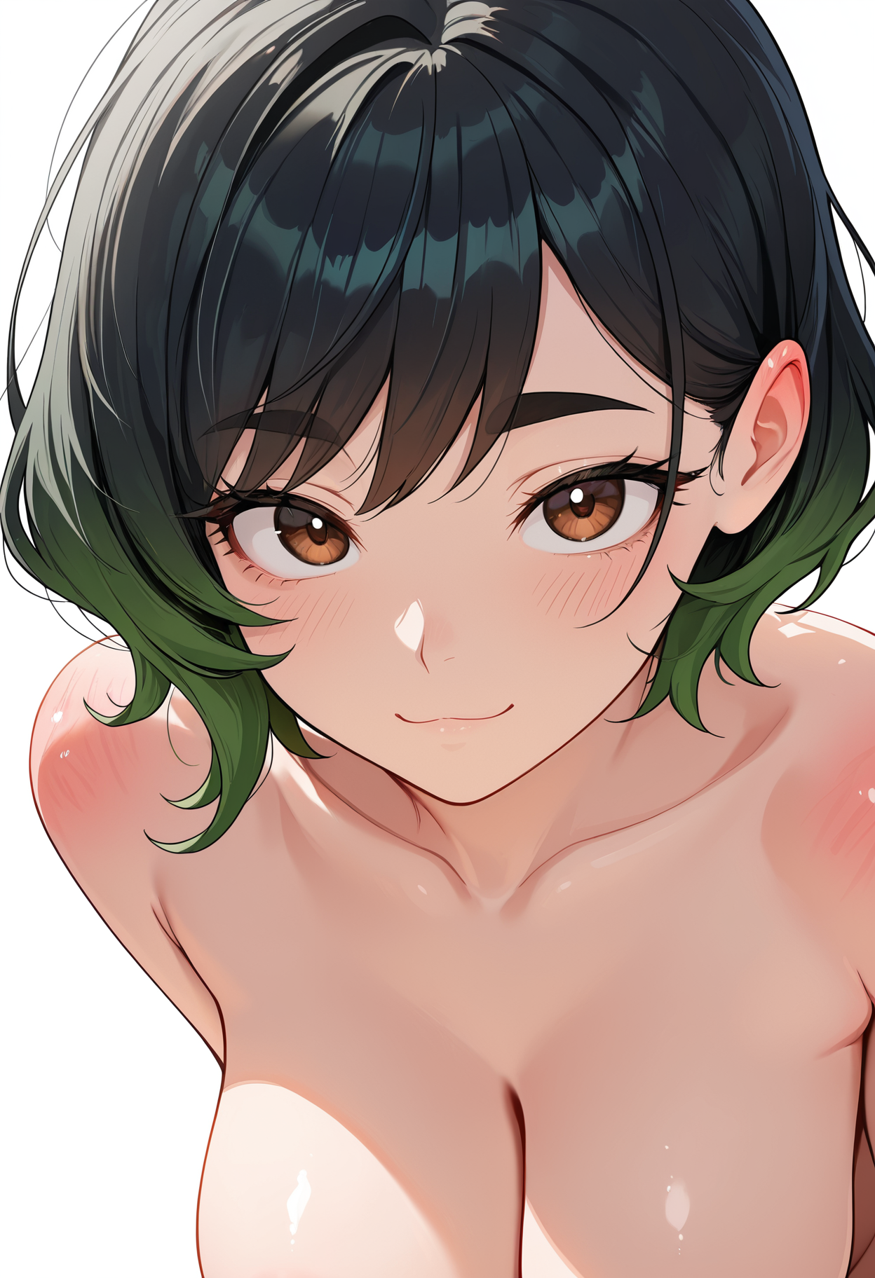
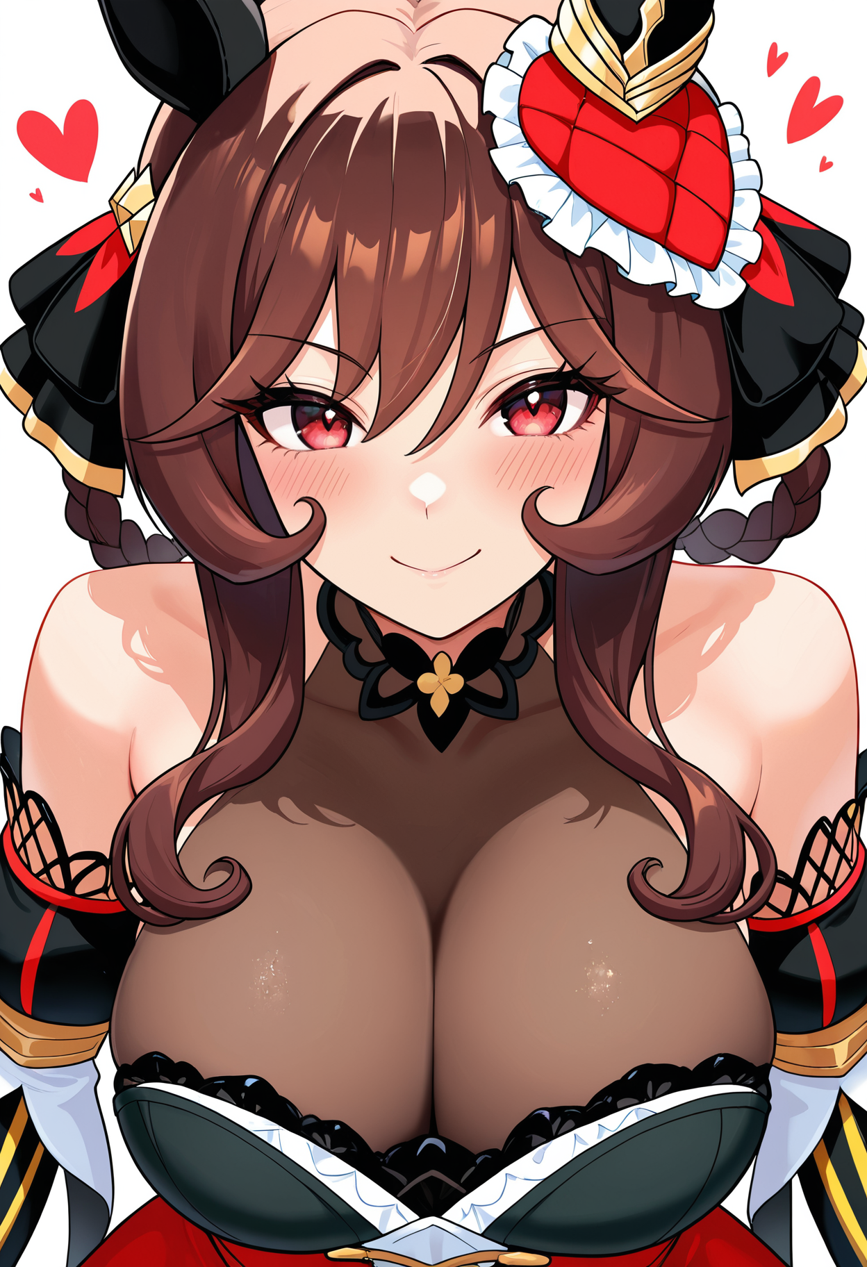
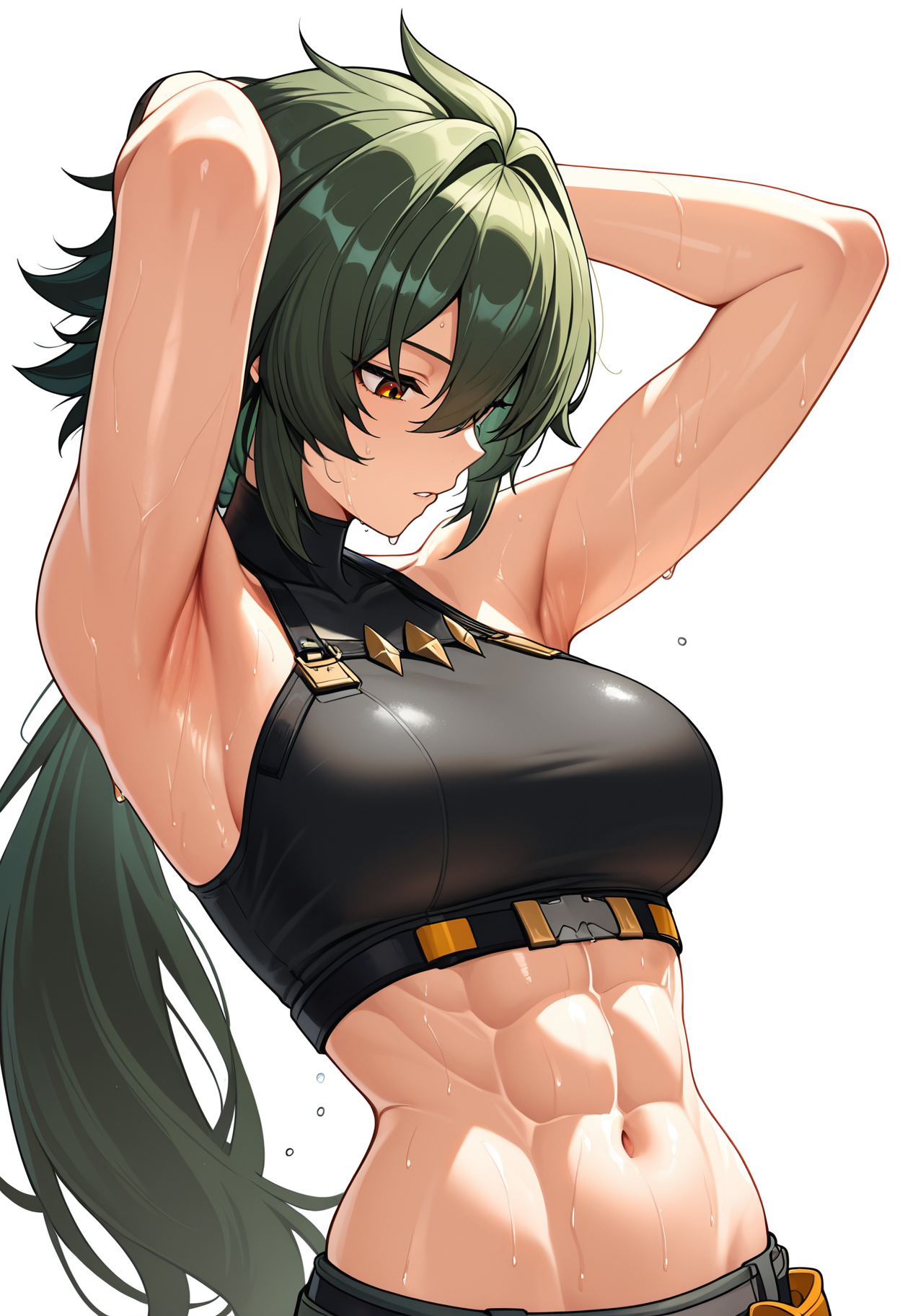
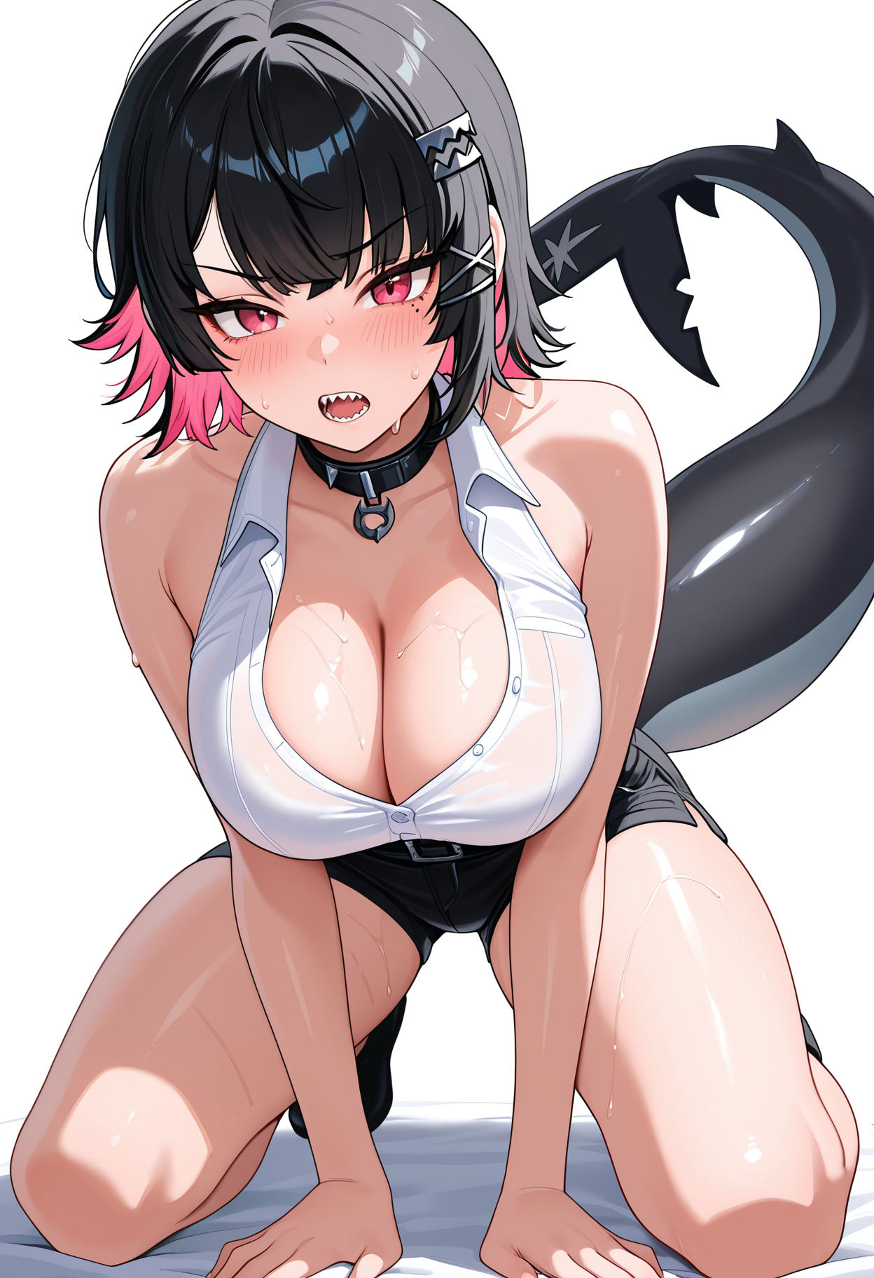
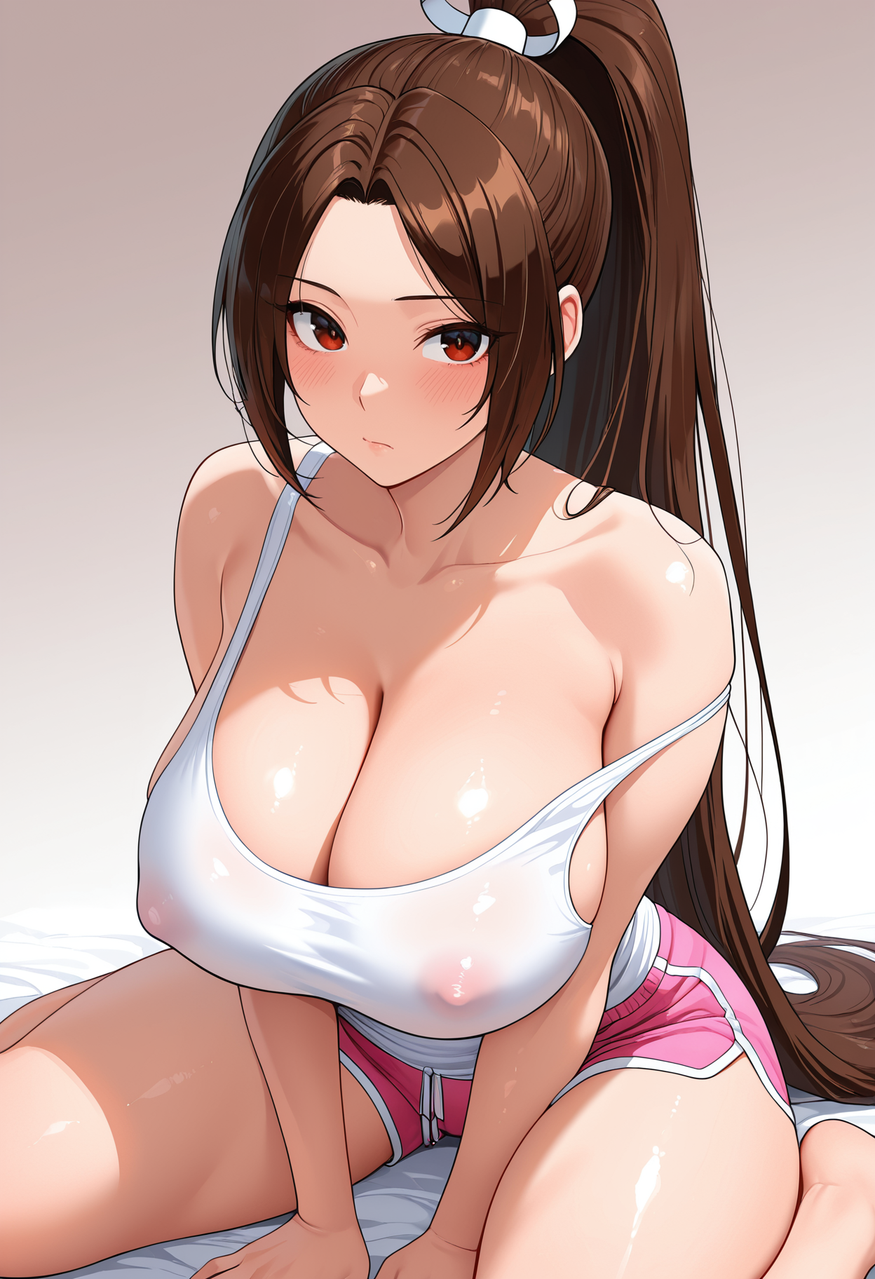
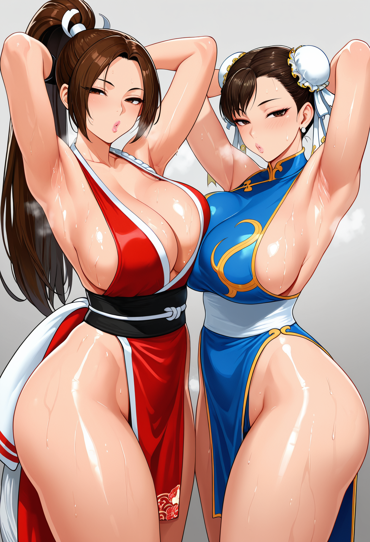
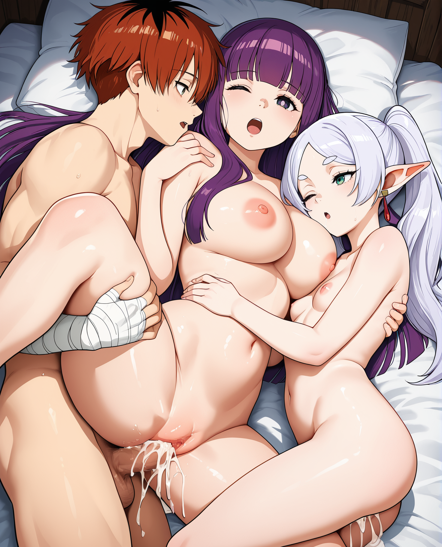
check the images for prompts
use lora at 0.7-1
Adetailer for faces
Img2img upscale
4x-ultra sharp
comment you idea or request
Suggested settings:
I had CLIP skip 1 on every image
Samplers : Eular A, DPM++ 2M
CFG : 5-6
I had ENSD: 31337 all of them
All of them had highres.fix or img2img at higher resolution.
I don't use restore faces
I use Adetailer for face details
4x-Ultrasharp upscaler
positive: masterpiece,best quality,amazing quality,absurdres,
negative: bad quality,worst quality,worst detail,sketch,censored,watermark, signature, artist name
Join my Discord Server
Description
less base style
included noob esp 1.1
should be much stable
better lora support
FAQ
Comments (36)
@Goofy_Ai can i ask what you used for lighting specifically in v1? Its so good ive not seen it reproduced like that anywhere else
hope one day to see mature base prefect version
you mean focused on milf?
@Goofy_Ai Indeed, but I know it’s not everyone’s cup of tea.
大佬你好,可以问下这个底模训练lora的参数是多少吗?
Sooo, nothing changed? Description doesn't tell anything
I don't know why he does that. He never says what actually changes. and we have to figure out if this is actually better or not. It's basically a "trust me, bro, this one is better."
There is an "about this version" box on the right side.
Thank you to continue supporting IllustriousXL :)
I have a question : for lora creation, is it time to switch to Illustrious XL 2.0 (OnomAI) or should I stay with Epsilon-pred 1.1 (NoobAI-XL) ?
keep training on ILXL1, personally when i tried training Styles on NAI1.1 they never came out right and were super weak. Characters train well on it tho.
@BMTZZ Thanks for your feedback. I used to use NAI 1.1 pred as my lora creation model. I got quite good results, maybe it depends on which you use. I prefer REX from easy lora training.
But you might be right, I will stay away from "new" things like ILXL 2 for training. As long as the usual works, it shouldn't need to be changed :)
And here I came
Nice model, thanks for the update.
My personal test result for 5.0 vs 4.0:
*5.0 clearly has higher color saturation and contrast.
*5.0 has more flat anime style baked in than 4.0, which is similar to 3.0.
*5.0 generally has more details on background and surroundings, but it also adds extra subjects or person into the background that you may or may not want.
*5.0 has less lora support due to its own strong style backed in.
*5.0 does not contain the entire newest danbooru dataset, just as 4.0.
For me personally, I may not import this 5.0 version into my flat anime workflow, instead I would simply use the wai15 I already get used to and seemed to have better lora support. The 4.0 (or its former version2.0) is still my main model for now.
After adjusting my workflow based on the 5.0 for several days, I realized that my previous comments were somewhat one-sided. Here are some corrections and additional viewpoints:
*5.0 is more outstanding in supporting the LoRa function compared to 4.0. This is because 4.0 has a built-in special 2.5D skin texture style, while 5.0 can generate various different textures. However, using LoRa with a strong lineart style in 5.0 might cause the image to appear too flat and lack details. In such cases, you may need to reduce the weight of LoRa, or using an additional skin texture LoRa.
*Using dpmpp and karras, and adopting a slightly higher CFG value, 5.0 can remove those redundant details in the background.
I also forgot to mention one advantage of using 5.0. That is, the stability of this version is as high as authur described, especially in the appearance coherence of the character under different facial expression prompts. Compared to many other models (such as NovaAnime, DivingFlatAnime), when adding facial expression prompts, their characters' apperance tend to become unstable, while 5.0 is more likely to generate consistent performance of the character. I think this is appealing to those who wish to create a comic strip without using character LoRa.
Then again, these are but my test result, hopefully helps with those beginners not knowing how to distinguish the version difference of a model.
5.0 delivered! Better lighting, body texture improvements, training data more versatile, small errors cleaned up and a few improvements to NSFW.
Below I'll list my early impressions after a day or two of use. I apologize for the lengthy wall of text, but I hope my limited observations can help further this models accuracy, so that everyone can feast from the spoils!
Also to Goofy, If you happen to come across this comment, I would urge you to differentiate the model names somehow, since this, in my humble opinion should be considered a continuation of 3.0, while right now people may end up with a few question marks if they directly compare it with 4.0.
⚠️Disclaimer: These are my observations from my personal test environment which uses my own custom artist mix, as well as Lighting control and other LoRA's.
I will start with the positives:
1. More mellow lighting with good contrast.
The model is now comfortable with lower lighting environments. The lighting doesn't feel as if a floodlight was targeted onto the girl, rather enshrouds her in way which allows for the skin tone to appear more natural.
2. Body details on female characters have seen changes.
(Preference based, but I think they're better now). One very noticeable one is the veeeeeery iconic reflective spot of light on womens breasts. That has been significantly reduced.
3. Error rate seems to be lower across the board.
A notorious issue for me was teeth. They would at times show up a bit chipped or otherwise damaged. Now that has been nearly completely fixed. Other issues that would stem from limited screenspace have been alleviated by the models improved handling of wider field of view which I cover in 5.
4. Watermark exclusion seems to be better? (Though this will vary a lot based on training data and artist styles).
5. Composition is significantly better.
While this may annoy some people, I find that tag adherence is good, but the models training data is more confident with working with wider compositions, which allows for more panoramic images where a broader field of view can be used. The lessened necessity of the model to cram everything up close also means that there will be a higher deviation in images that use the same prompt data. A rather "professional" feature that maybe more casual users can find cumbersome at times. I greatly appreciate it.
6. LoRA compatibility is better.
This will require significantly more in-depth testing, but my initial testing shows a blend of marginal improvement and neutral results. Nothing broke, and some got better. The ones that didn't get better, remained the same.
7. Better expression data.
There's a wider range of facial expressions that use the same tag. Could be very anecdotal on my end.
8. X-ray effects are better.
Both LoRA'd ones and default.
Now I will cover the negatives:
1. Text seems to want to creep up more often than before.
It could be just be character or franchise specific, but speech bubbles are popping up slightly more than before (which was already fairly rare). I will curate my UC to minimize this going forward.
2. Eyes are less expressive and detailed.
This one is the biggest issues I've had so far, and unfortunately, it's a rather big one. Below I have explained my workaround, but it's a resource heavy workaround.
Also it could be just how my artist mix works with the training data. But in general a few effects around the eyes, as well as makeup seem to be less prominent this time around. Some issues are solved with increasing the weight of tags, some not. The layering of the eye socket is simpler and eyeshadow doesn't seem as high quality as 3.0.
As a solution I'm running a dual checkpoint workflow with 3.0 that handles face and eye bbox Adetailers.
3. Male data seems simpler.
Faceless men don't look as cool anymore. Before they'd at least retain some small features like more prominent cheekbones, jaw shading, small beards etc. Not a huge loss, but can be noticeable a bit.
4. Clothing textures seem to be more 2D and have heavier outlines.
Not all, but some transparent articles of clothing, or lacey undergarments are a bit simplistic in their coloring and texture quality this time around. While not an egregious issue, this can be mostly finetuned.
I appreciate everyone who bothered to read the insights of some random person like me on the internet.💖
I personally will switch to 5.0 as my main checkpoint and use a dual checkpoint workflow to handle the minimal issues I have with it.
Do you have a list of artists I can use in promts?
Dear highly educated people, which version is the best? 🥰
遠坂凛大好き
Clearly the best checkpoint around. Goofy you madman.
Anyone notice that 5.0 seems to do much less detail and "simpler" style than 4.0? At least with the same parameters it feels like a bit of a downgrade for simple usage.
4.0 plz come back
need 4.0 back. 5.0 seems like a downgrade in quality :(
like e.g hands / fingers feels worse on 5.0
5 changed too much.. everything seems to be flatter, less detailed and more cartoonish :/
Another new version that is somehow a downgrade. 2 and 4 have been the only serviceable models!
please bring back v4, v5 is clearly much worse
5 is a downgrade, bring 4 back
You can always down the 4 version anytime.
I have found that 4.0 and 2.0 produce more detailed, less flat images than 5.0 and 3.0, I don't know who's paying all this buzz to keep five and three on site
It is me Dio!!! (Sorry i had too) :D
Which one would you definitely choose and why?
@chtmpeterpettigrew561 I would choose 2>4>3>5 and haven't used 1 or 6 enough to have opinions. I think that 2/4 are more flexible in terms of being able to generate realistic 2D in addition to 2.5D and flat/"toon"-style stuff, where 3/5 often don't look as good outside of the more flat/toon/anime styles
E: they're all mostly fine, but there are a lot of mostly fine checkpoints to choose from
Details
Files
prefectIllustriousXL_v5.safetensors
Mirrors
prefectIllustriousXL_v5.safetensors
prefectIllustriousXL_v5.safetensors
prefectIllustriousXL_v5.safetensors
prefectIllustriousXL_v5.safetensors
prefectIllustriousXL_v5.safetensors
prefectIllustriousXL_v5.safetensors
prefectIllustriousXL_v5.safetensors
prefectIllustriousXL_v5.safetensors
prefectIllustriousXL_v5.safetensors
prefectIllustriousXL_v5.safetensors
pr3f3ct_5_0.safetensors
Available On (5 platforms)
Same model published on other platforms. May have additional downloads or version variants.